Lozi Mobile Experience
Jul 2022 • UI/UX Design • Figma, Zeplin
Lozi is a mobile app tailored for delivery drivers in South Korea, aiming to enhance and expedite the delivery experience through check-in services. With the integration of QR codes, drivers can effortlessly check in at pick-up and drop-off locations. Notably, the app facilitates seamless searching for new delivery jobs, streamlining the overall process for drivers.
“Few apps cater specifically to delivery workers, lacking a comprehensive range of services like job discovery, mobile check-in/out, and paystub management.”
Problem Space
User Flow & Sitemap
The Lozi app revolves around four primary functions: Login/Register, Apply for Work, Reporting Work, and Work History/Status Check. Our approach emphasizes simplicity and straightforwardness to accommodate the fast-paced nature of delivery work.
Colour Palette & Typography
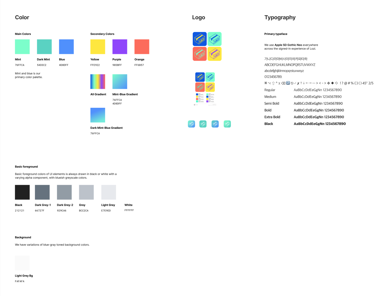
Given our existing logo's vibrant six-color palette, I opted for one or two main colors to maintain a cohesive UI without overwhelming users. A consistent typographical scheme was implemented, with our primary color being blue, influencing the slightly bluish grey tone of the black gradient colors.
v.1.0
The primary color chosen for the UI is blue, derived from the existing logo color palette.
v.1.1
The primary colour as mint after receiving feedback from client.
Design System
Icons, components, and controls maintain a consistent hover language and adhere to a universal design. The careful selection of font and icon sizes ensures readability and legibility across the interface.
v.1.0
Before colour update
v.1.1
After colour update
A/B Testing - Splash Screen
To enhance user experience during app loading, multiple versions of the splash screen have been created, providing additional interactive feedback.
Option A
The original splash screen is straightforward, featuring a multi-colored progress bar that complements the vibrant logo.
Option B
The second version of the splash screen incorporates a colored background that ascends, revealing the login buttons. Users responded positively due to the high contrast between elements and background, contributing to its effectiveness.
Option C
The third version of the splash screen introduces a loading animated visual element at the bottom, featuring the two primary brand colors—blue and mint.
Improvements after receiving User Feedback
A. Progress Bar Implementation
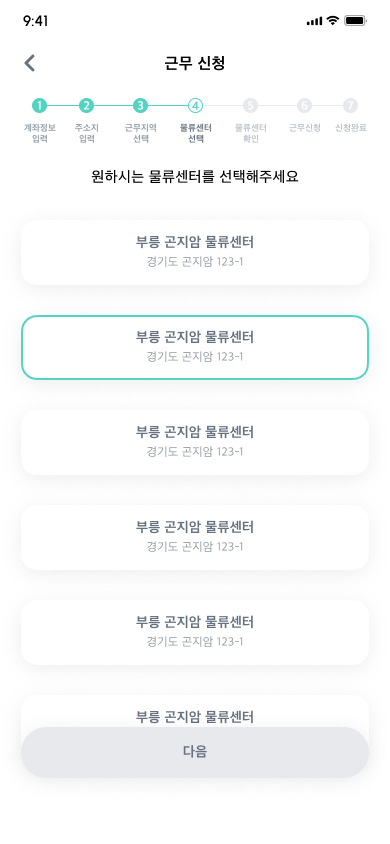
The breadcrumbs above the job application process have been transformed into a visual progress bar, enhancing user comprehension and facilitating faster information grasp.
Before
The use of text-based breadcrumbs led to an overload of text in the interface.
After
The implementation of a visual progress bar provides a more appealing and quicker way for users to grasp information, fostering an intuitive design approach.
B. Addition of Cancel Button
A cancel button option has been introduced on the Dashboard screen, addressing user needs and providing a faster editing option for upcoming work placements.
Before
As of now, users lack the option to modify or cancel work; the only available action is the ability to check-in.
After
Users now have the capability to modify or cancel their upcoming work placements directly from the home screen, providing greater flexibility and control.
C. Color system update, QR code removal for check-out
I developed an alternative version utilizing a second color palette, and to expedite the process, the QR code section for getting off work was removed as it was deemed unnecessary for users.
After
Users can now complete the process of getting off work more rapidly, eliminating the need for a second verification step.
Before
Previously, an additional step involved QR code verification for checking out from the workplace.
User Feedback
“As a delivery driver, I would utilize the platform to discover new job opportunities. There are limited platforms that specifically cater to delivery jobs, providing commuting information and immediate details about the drop-off location.”
Jay Kim, Beginner Deliveryman • Experience: ~ 1 year
“I enjoy the app's visual design, especially the work schedule overview and favorited workplaces. The tier system motivates me to work harder and progress. Adding rewards linked to these tiers would enhance the overall user experience in the future.”
Janet Lee, Intermediate Deliverywoman • Experience: 2 ~ 3 years
“Knowing the bus schedule is useful, but having constant access to company contacts and a 24/7 support system for emergencies would be valuable additions.”
Chanyoung Park, Expert Deliveryman • Experience: 4 ~ year


